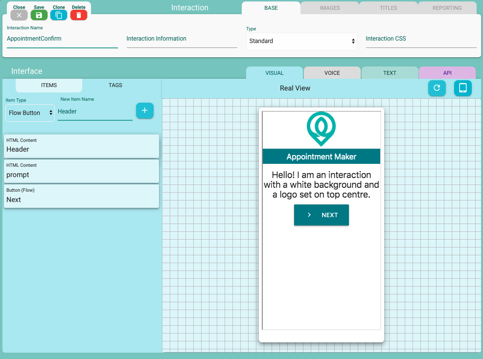
Visual Interaction
Visual interaction can contain different components such as background, logo, headings, buttons, etc. Here are a few steps to configure components of Visual interactions
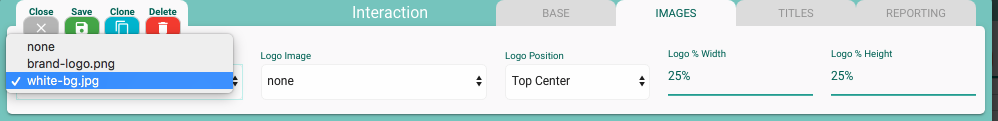
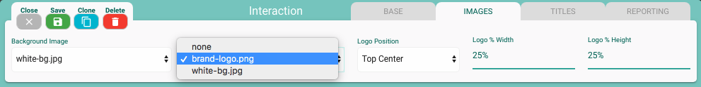
Interaction Background
Visual background can be easily set using a background image that is already uploaded under your Project Assets. Here is the setting on Interaction modal
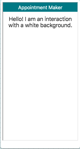
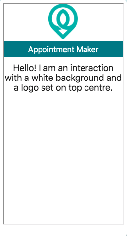
Here is a sample interaction with white background image
Interaction Logo
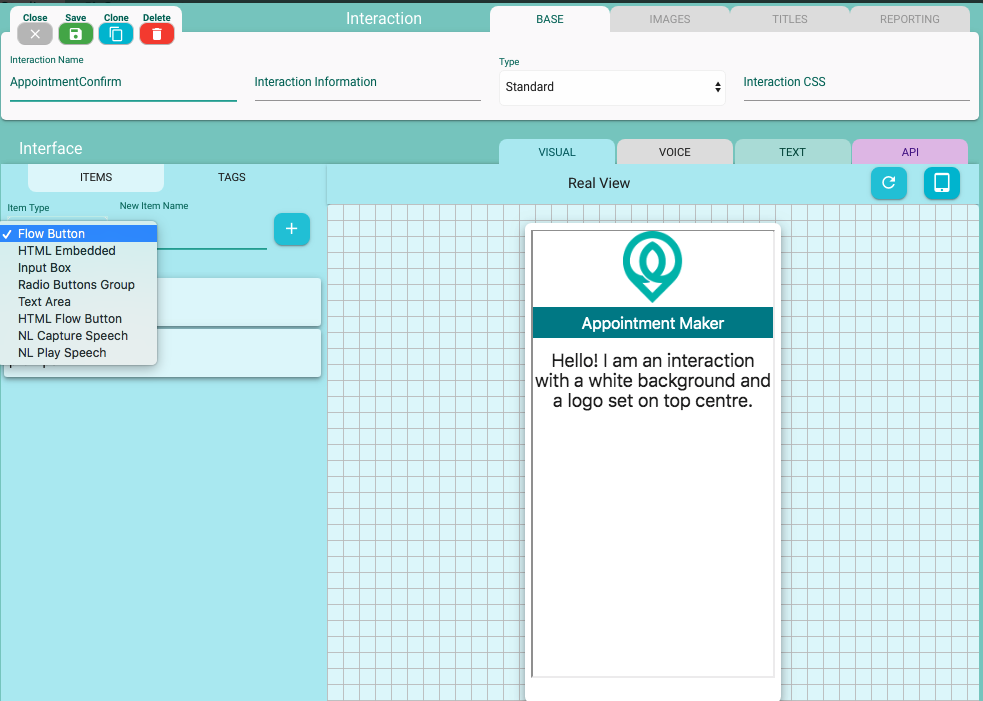
A logo can be set on top of your interaction using the Logo Image setting with position and size parameters. Size parameters(width and height) should be provided in percentages. Here is how you set the logo
Here is an interaction with the logo set at the top centre position with 25% width and height
Interaction Items
There are different interaction items available for Visual interactions. Let's have a look at few of them
Flow Button
This item is used to create a flow button, which basically works like a hyperlink. This item can be connected in the Camlin Studio wireframe Visual channel view for building a flow. Let's have a quick look at this interaction item and its settings.
Add a Flow Button
To add a flow button simply select it from the interaction Items Type drop-down, give it a name and add on the + button.
 Once added it appears as a link
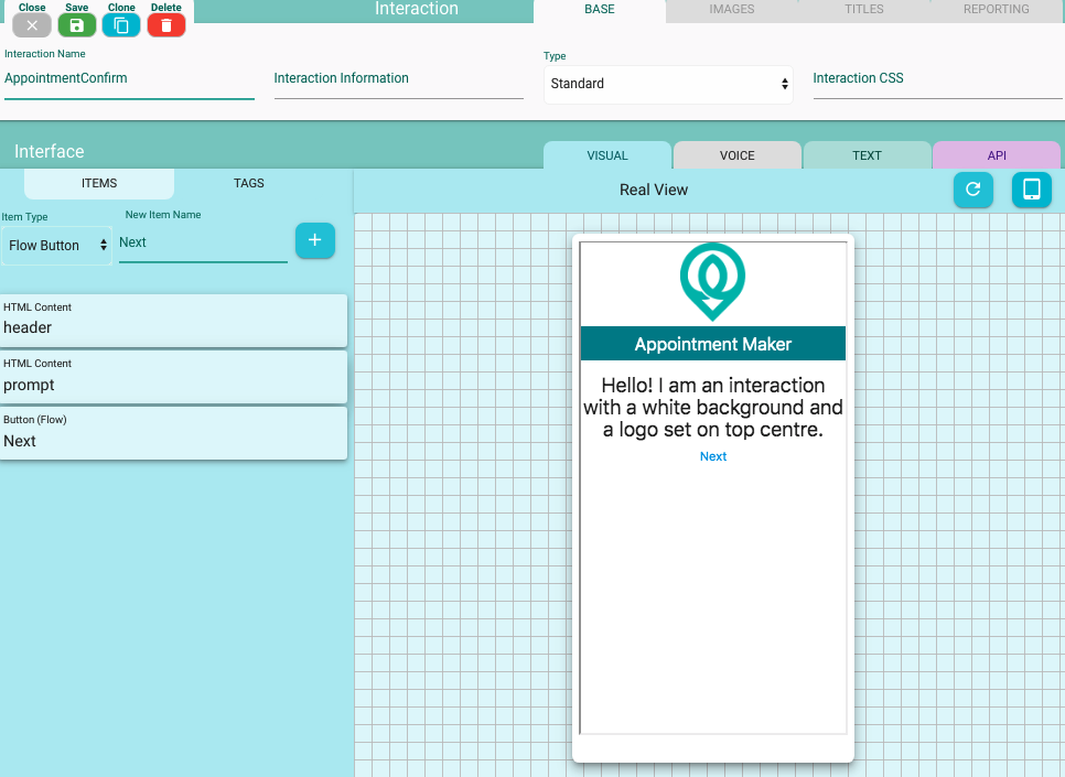
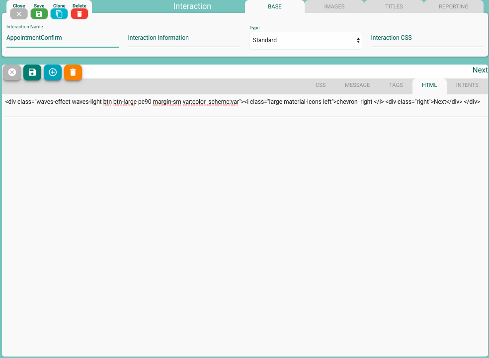
Customize Flow Button
You can easily style this link to look like a button for example. Just double click on the interaction item on the left and that will open a settings screen on the right. Under those settings tab, click on HTML to put in an HTML that you want to use to style this Flow interaction item
 Once you put in a custom HTML, the updated item will appear with your custom HTML applied
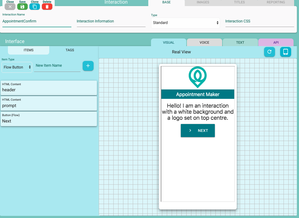
Here is an html snippet designed using materalize css
<div class="waves-effect waves-light btn btn-large pc90 margin-sm var:color_scheme:var"><i class="large material-icons left">chevron_right </i> <div class="right">Next</div> </div>
Best practice : It is advisable to use a variable for your button color as mentioned in the above snippet. This basically allows you to quickly change all the buttons to a different color on all of your interactions. Always use variable substitutions for such things like color, size, etc. The variable in the above snippet is declared in your project, and in this case it is saved as a text var with naem color_scheme and value as cyan.
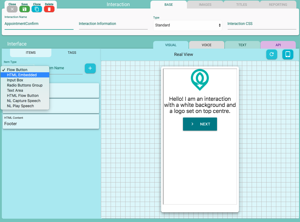
HTML Embedded
This item is used to embed custom HTML elements such as labels, headings, free flow text, inputs, etc
Add an HTML Embedded interaction item
To add a flow button simply select it from the interaction Items Type drop-down, give it a name and add on the + button.
Customize HTML Embedded
It is a blank item by default and has no effect until you add an HTML to it. To customize, just double click on the interaction item on the left and that will open a settings screen on the right. Under those settings tab, click on HTML to put in an HTML that you want to use. Here is a sample of a header HTML
<div class="var:color_scheme:var white-text" style="height: 38px; width 100%; font-size: 20px; line-height: 40px">Appointment Maker</div>
Here is the result on the generated interaction
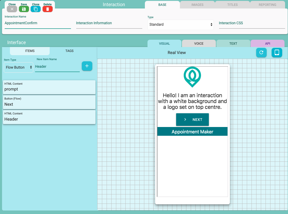 To make this HTML embedded item appears on the top, it was simply dragged and dropped to the top of the list of items